Against the Beige Box: Luxury Wall Murals and the Return of Atmosphere
By Geneviève Ashworth · Published August 7, 2026
The Beige Room Has Lost Its Alibi
My dears, let us say the impolite thing softly: the beige room has lost its alibi. For several years it could claim serenity, resale value, discretion, quiet luxury, the noble refusal of fuss. But too often the result has been not calm but absence. A sofa the colour of oatmeal, a rug the colour of apology, curtains like unsalted linen, a coffee table with three admirable books no one dares disturb. Everything tasteful. Nothing remembered.
This is not an argument against restraint. Heaven preserve us from that tiresome misunderstanding. Restraint is one of the great luxuries. But restraint must contain tension, memory, light, texture, a small pulse of risk. Without those, a room becomes a beige box: expensive, obedient and emotionally unemployed.
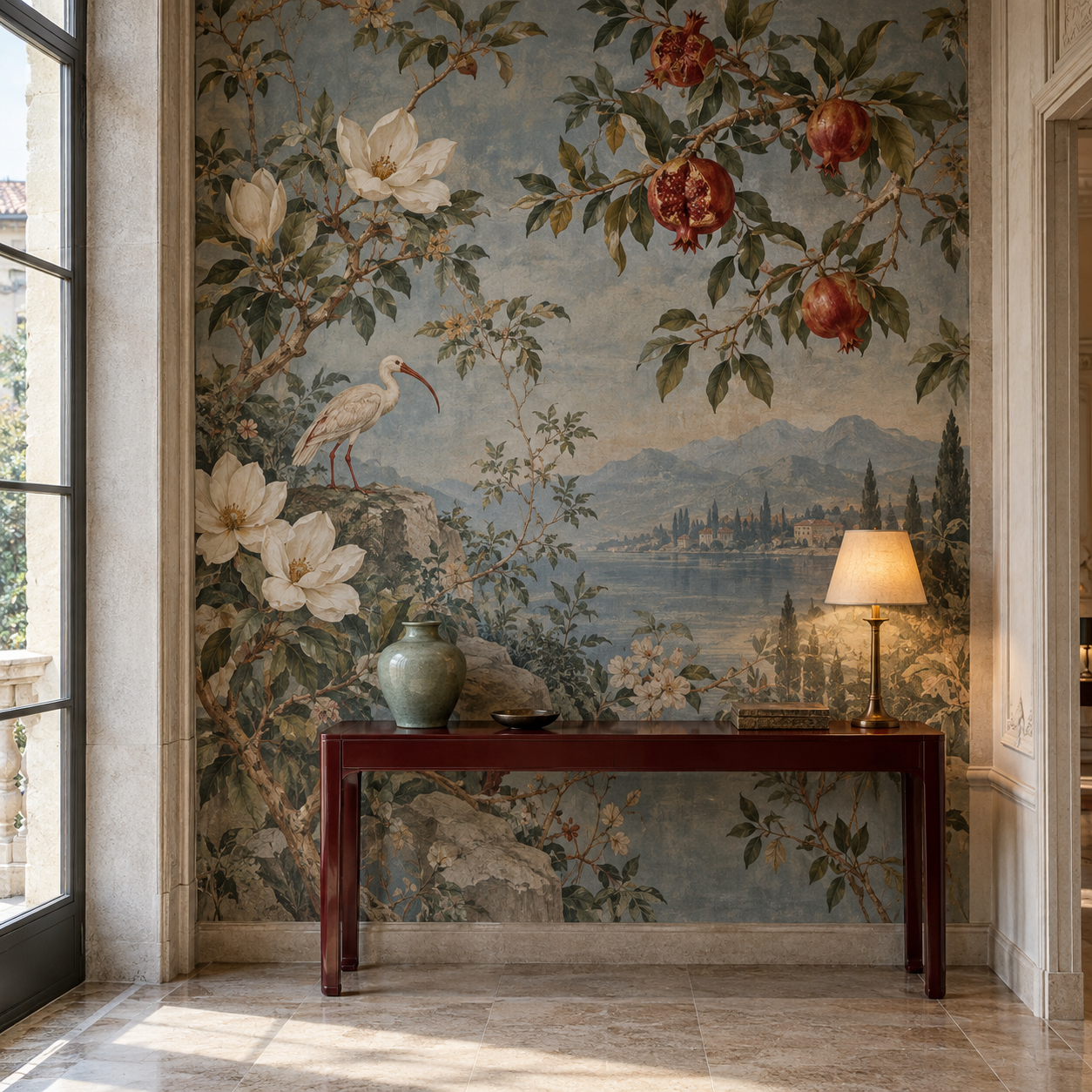
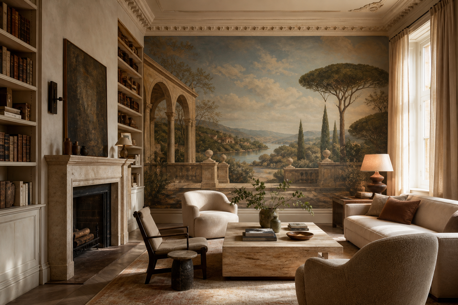
This is precisely where luxury wall murals for neutral interiors become so compelling. A mural can keep the softness clients want while restoring the thing they did not know they had lost: atmosphere. It can give a quiet room a horizon, a season, a narrative temperature. It can let the furniture remain restrained while the wall begins, at last, to breathe.
Neutral Is Not the Enemy
The current conversation is already turning. House Beautiful’s recent piece on the beige epidemic frames the problem not simply as a colour issue but as one of banality: rooms that feel copied, emptied of specific life, too ready to belong to anyone. Livingetc’s 2026 trend discussion makes a similar point from another angle, noting that the all-beige aesthetic is beginning to fade because it often lacks depth and individuality.
But neutral is not the enemy. The lazy neutral is the enemy. Warm plaster, mushroom, parchment, stone, old ivory, tobacco, lichen, dusted rose, olive-grey, mineral blue seen almost as shadow: these are magnificent colours when they have something to do. A neutral palette can be deeply emotional if it is layered like a stage set rather than flattened like a rental brochure.
That is the distinction designers must defend. Beige used as silence can be beautiful. Beige used as fear is not. A mural gives the neutral room a structure in which restraint can become expressive again.
A Mural Gives the Eye a Horizon
A scenic mural does something that paint, however exquisite, cannot quite do. It gives the eye a destination. Not necessarily a dramatic one. Sometimes the gift is simply a distant hill, a pale arcade, a river beyond a balustrade, a grove fading into mist, a sky that holds more than ceiling height. The room remains calm, but it is no longer sealed.
This is why our recent essays on living room murals and bedroom murals return so often to the horizon. The horizon is not a motif. It is a kindness. It gives the body a sense that the room continues, that there is air beyond the furniture, that the wall is not the end of imagination.
In a neutral interior, that matters enormously. Pale upholstery, limestone, oak, linen and plaster can become monotonous when every surface sits at the same emotional distance. A mural corrects the depth field. It lets the room keep its quiet manners while adding foreground, middle ground and distance. Suddenly the chair is not merely in a room. It is before a landscape.
The New Luxury Is Atmospheric, Not Loud
The most persuasive current wallpaper thinking is not about novelty. ELLE Decor’s 2026 wallpaper trend report points toward atmosphere, emotion, tactile surface, hand-painted character and sophisticated colour. Notice those words. They are not loud words. They are not maximalist slogans. They are the vocabulary of rooms with presence.
This is the useful answer to the beige backlash. One need not replace a restrained interior with theatrical chaos. One can instead deepen it. A matte scenic paper, a hand-painted silk used with discipline, a mineral-toned panorama, a grisaille garden, a faded architectural capriccio: these bring personality without demanding that every cushion join the argument.
There is a particular chic in this. The room still appears controlled at first glance. Then the eye adjusts. A tree emerges from the mist. A ruin holds the corner. The wall light warms a painted sky. The client discovers that calm can contain story. That is far more luxurious than calm that contains only procurement.
What the Historic Panorama Still Knows
Of course, scenic walls have always understood transport. The Musee du Papier Peint describes panoramic scenic wallpapers as landscapes formed from sheets pasted side by side so that the inhabitant feels surrounded and imaginatively carried elsewhere. That is not a quaint historical detail. It is the very mechanism neutral rooms need now.
The great panorama was never merely pattern. It was an argument against the wall as boundary. It turned dining rooms into gardens, salons into voyages, bedrooms into remembered places. It gave domestic life a world beyond its own architecture. In the 19th century this was romantic, technical, theatrical and social all at once. Today, after years of flattened interiors, the idea feels startlingly fresh.
Real Simple’s recent report on the mural revival notes that murals are again being embraced for immersive, personal spaces that feel both timeless and integral to a home’s identity. Quite right. The best mural does not sit on the room like an accessory. It becomes the room’s memory system.
How to Keep a Neutral Mural From Going Flat
There are, naturally, ways to get this wrong. A neutral mural can be too washed out, collapsing into expensive fog. It can be too literal, turning the room into theme hospitality. It can be too sharp, making the quiet furniture look underdressed. It can be too busy, so that the client who asked for serenity finds herself living inside a decorative monologue.
The answer is not caution but calibration. The mural should have tonal movement, not noise. It should contain enough contrast to be legible at dusk and enough softness to remain livable at noon. Its ground should speak to the room’s materials: limestone, walnut, wool, bronze, plaster, linen. Its colours should be neutrals with ancestry, not neutrals with no pulse.
I like a mural that behaves differently through the day. In morning it should be air. In afternoon, depth. In evening, theatre. If it looks identical under every light, it may be technically competent, but it has not yet become atmosphere.
Which Mural Language Belongs to the Neo-Neutral Room?
Ananbo is especially persuasive for this conversation because its best landscapes understand nostalgia without becoming dusty. A pale Mediterranean distance, a misted grove, a sepia coastline, a dream of travel seen through old light: these can rescue a neutral room from muteness while preserving its tenderness. The scene need not overwhelm. It need only remind the room that it has a soul.
Zuber brings historical authority and the grandeur of scenic paper as decorative architecture. De Gournay can supply hand-painted delicacy and luminous grounds for clients who want a neutral room with private shimmer. Nobilis and Elitis are useful when texture must do as much work as image. Pierre Frey can give the restrained room a more layered, textile intelligence. Designers Guild, used with discipline, can introduce a brighter confidence without tipping into noise.
The choice should follow the emotional problem. If the room is bland, do not merely add pattern; add depth. If it is cold, add warmth and hand. If it is beautiful but forgettable, add a view. If it is already full of objects, choose a quieter ground. A mural is not a costume for the wall. It is a climate for the room.
A Specifier's Checklist for Depth Without Noise
A practical checklist, then. First, decide what kind of neutrality the room actually needs: serene, warm, monastic, collected, antique, coastal, mineral, urban, theatrical or restful. Second, locate the missing dimension. Is the room flat because of colour, lack of texture, lack of contrast, lack of history, poor lighting or a furniture plan that has no visual destination?
Third, test the mural beside the real materials, not a fantasy sample board. Linen, stone, timber, metal, rug, lamp shade, art, books and curtain lining will all change the reading of the wall. Fourth, judge the design in at least three lights: morning, afternoon and evening lamp. Fifth, decide whether the mural should wrap the room, sit within moulding, occupy one principal wall or appear as a sequence of panels.
Sixth, protect the lower wall if life requires it. A dado or painted base can make a mural feel more architectural and more durable. Seventh, leave some silence. The strongest neutral rooms do not need every surface to confess its importance. Let the mural carry the far distance; let the furniture remain close, human and useful.
Rooms Should Have Weather
The rooms I remember are not always the boldest. They are the rooms with weather. A little dawn in the plaster. A shadow moving across a painted tree. A landscape half-seen behind a lamp. A wall that makes the sofa feel placed in a world rather than purchased for a room.
This is what the beige box cannot provide, however expensive its upholstery. It can provide calm, yes. But calm without atmosphere is merely stillness. Calm with atmosphere is something else entirely: a room that lowers the voice, slows the hand, changes with the light and gives memory somewhere to settle.
So by all means keep the linen, the stone, the quiet chair, the generous curtain, the intelligent neutral. But give the room a horizon. Give it a view it did not architecturally inherit. Give it a wall that knows how to dream. The future of neutral interiors is not less beauty, my dears. It is more depth.