Beyond Color Drenching: Luxury Wall Mural Ideas for Rooms with Depth
By Noora Al Hashemi · Published August 24, 2026
Color Drenching Is a Mood, Not a Memory
Color drenching has been a useful correction. After years of white boxes, pale grey apartments and rooms that seemed designed to offend no one, there is pleasure in seeing walls, trim, doors and ceilings take on a single confident shade. A saturated room can feel calmer than a room of many anxious accents. It can make architecture read as one gesture. It can give a client who fears pattern a surprisingly elegant way to commit.
And yet, as with all useful ideas, it becomes less useful when it is treated as the final answer. A color-drenched room has mood, certainly. What it may not have is memory. It can be enveloping but still flat, handsome but still airless, chic in a photograph but oddly brief in real life. One enters, registers the color, admires the courage and then asks, almost silently: what next?
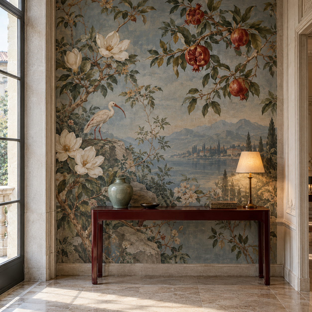
This is where luxury wall mural ideas become interesting for designers now. Not as a rejection of color drenching, but as its more sophisticated successor. A mural can keep the immersive discipline of a drenched room while adding view, distance, climate, narrative and the small hospitality of somewhere for the eye to travel.
Why Designers Are Ready for the Next Layer
The current design conversation is already moving in this direction. HGTV’s discussion of color capping describes designers layering a second hue onto a drenched room to add depth and contrast. The instinct is correct. Pure immersion can become too sealed. Rooms need a little horizon, even when that horizon is chromatic rather than literal.
Wallpaper is answering the same desire with more artistry. House Beautiful’s 2026 wallpaper trend report notes the move toward floor-to-ceiling wallpaper applications and immersive murals that shape the experience of a room rather than merely decorating it. ELLE Decor’s wallpaper trends coverage uses the language I find most persuasive: atmosphere, emotion, tactile surfaces, hand-painted character and sophisticated color.
For specifiers, this is not a small distinction. Paint can give a room unity. A mural can give it a world. The most interesting rooms of the next season will not ask whether color or mural is more fashionable. They will ask how color can prepare the architecture, and how a mural can give that architecture somewhere to go.
A Mural Can Drench a Room in Distance
A scenic mural does what a single paint color cannot do, no matter how beautiful the pigment. It creates distance. It establishes foreground, middle ground and far ground. It lets a compact room borrow a garden, a coastal path, a loggia, a grove, a pale ruin, a dusk sky. It gives the eye a route through the wall instead of asking the wall to remain a perfectly colored stop sign.
The Musee du Papier Peint’s account of panoramic scenic wallpapers is useful here because it reminds us that the great panoramas were designed to surround the room and imaginatively transport the person inside it. Surrounding is the shared ambition of color drenching and scenic wallpaper, but transport is where the mural becomes more generous.
That generosity matters in luxury interiors. A guest should not feel trapped inside a color, however exquisite. A client should not tire of a room after the first spectacular photograph. The best mural lets the room remain enveloping while giving the mind a way out: across water, through trees, under an arcade, toward a horizon. It is immersion with air.
Let Paint Hold the Room and Wallpaper Carry the Story
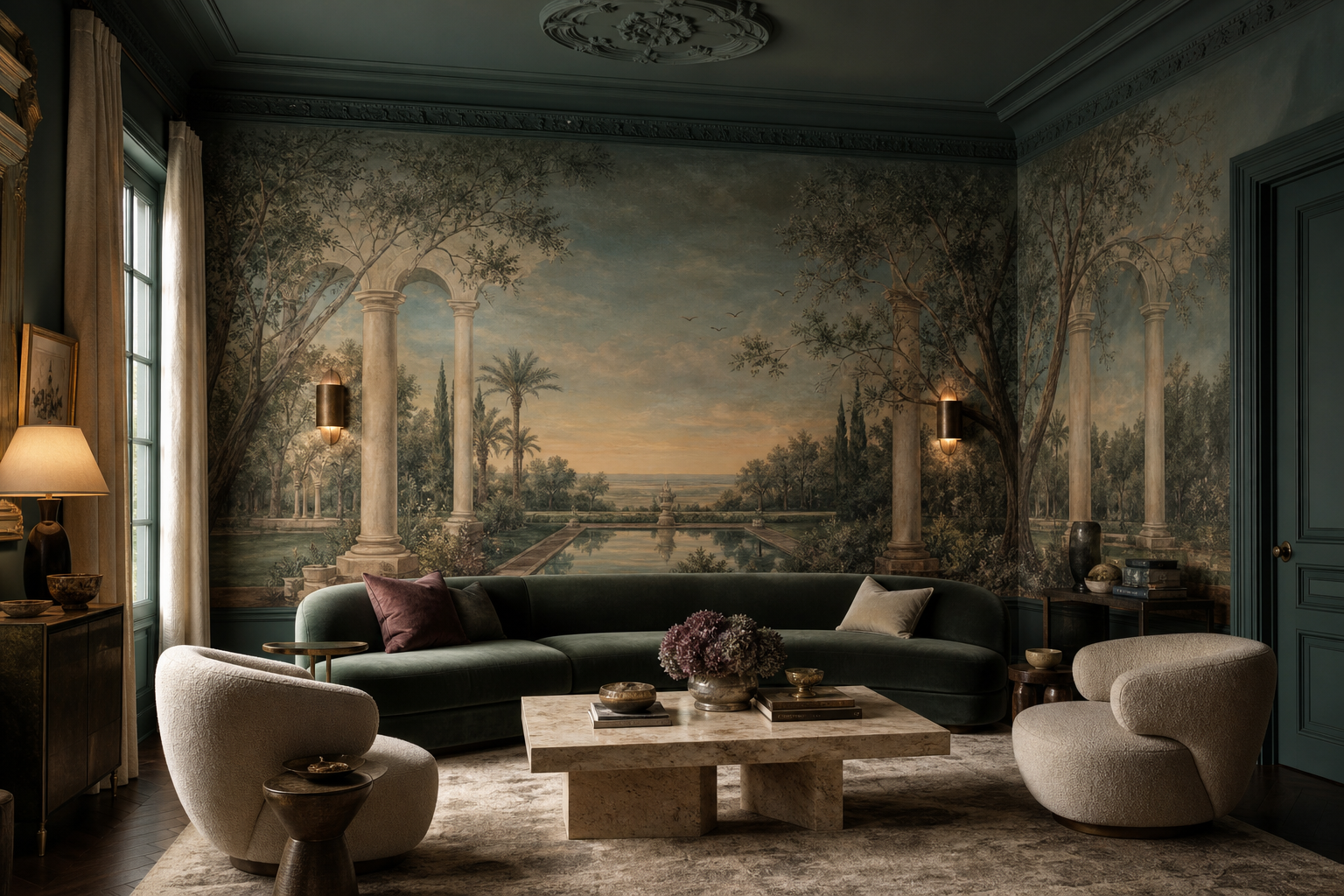
The most successful strategy is often not to choose between paint and mural. Let paint hold the architecture; let the mural carry the story. Drench the trim, doors, skirting and perhaps the ceiling in a color drawn from the mural’s ground or shadow. Then allow the scenic paper to introduce the dimension that paint cannot supply.
This can be done quietly. A mineral-green room may hold a faded garden mural with olive, celadon and dusk blue. A tobacco-brown study may accept a sepia architectural capriccio. A plum dining room may be softened by a moonlit chinoiserie landscape with smoke, ivory and black-green foliage. A red lacquer passage may become less aggressive if the mural gives it depth through distant stone and sky.
Our recent pieces on neutral interiors and panoramic wallpaper as architecture approach the same problem from opposite sides. A neutral room needs atmosphere so it does not become mute. A scenic room needs architectural commitment so it does not become a poster. The color-drenched mural room needs both: chromatic courage and spatial intelligence.
The Ceiling Question Changes Everything
Color drenching has also made designers look up again, and that is a welcome development. When walls, trim and ceiling share a color, the ceiling stops being an apology. It becomes part of the envelope. Wallpaper drenching goes further by asking whether the ceiling should continue the story, interrupt it, lighten it or frame it.
Good Housekeeping’s 2026 wallpaper trends includes scenic panels and unexpected wallpaper applications, including ceilings. House Beautiful also points to wallpaper used everywhere to create a fully enveloping effect. The temptation, of course, is to cover every surface with equal enthusiasm. I would be careful. A room can be immersive without being relentless.
Sometimes the ceiling should be drenched in the mural’s darkest green or softest blue, giving the scene a quiet cap. Sometimes it should be a paler atmospheric field, a cloud, a tented wash, a branch, a hand-painted border or simply painted plaster that lets the walls breathe. We have already praised the fifth wall, but the lesson is not that every ceiling must perform. The lesson is that every ceiling must be considered.
Which Mural Language Belongs Beyond Color Drenching?
Different mural languages change the emotional temperature of a drenched room. De Gournay is persuasive when the room needs hand-painted softness, luminous grounds, birds, branches and the feeling of couture craft. In a color-drenched interior, that human touch can prevent saturation from becoming merely graphic. Zuber brings historical authority and panoramic discipline, particularly when the architecture can accept a serious scenic sequence rather than a decorative flourish.
Ananbo belongs where the room needs landscape as recollection: a Mediterranean distance, a tropical memory, a horizon that feels more dreamed than described. Pierre Frey can be excellent when pattern, textile and upholstery need to behave as one family. Nobilis and Elitis are useful when texture is the luxury and the mural must speak softly. Designers Guild can bring joy and confidence, provided the surrounding room has enough restraint to make exuberance feel intentional.
The choice should begin with the client, not the sample. Some clients need reassurance before they can accept a mural, and color continuity gives them that reassurance. Others need permission to move beyond a fashionable paint idea toward something more personal. The designer’s task is to translate mood into life. A color can begin that translation. A mural can finish the sentence.
A Specifier’s Checklist for Immersive Color and Scenic Walls
A practical checklist, then. First, decide what the color is doing. Is it calming the room, making plain architecture feel intentional, lowering the ceiling, warming the light, hiding doors, connecting joinery, or giving the client courage? Second, decide what the mural must add that color cannot: distance, story, softness, ceremony, wit, landscape, memory or view.
Third, choose the mural and paint together. Do not approve a wallcovering and then panic-match trim afterward. Pull the trim color from the mural’s shadow, branch, sky, stone or ground. Fourth, test everything vertically in the actual room. A paint chip on a table is not a room. A mural sample in the hand is not a wall. Look in morning light, late afternoon and evening lamplight.
Fifth, draw the elevations. Include ceiling height, cornice, doors, curtain stacks, sockets, sconces, switches, furniture backs, art, mirrors, radiators and cabinetry. Sixth, decide whether the mural wraps, sits within panels, occupies one principal wall with meaningful returns, or continues onto ceiling and doors. Seventh, protect the lower wall. Immersive rooms are still rooms with chairs, hands, children, pets, luggage and time. Beauty must be maintained, not merely unveiled.
Give the Room a View, Not Just a Hue
The weakness of color drenching, when it has one, is that it can make a room feel complete too quickly. The eye enters, understands the gesture and has nowhere else to go. Luxury should be slower than that. It should reveal itself in layers: first the color, then the texture, then the lamp against the wall, then the branch turning the corner, then the distant water seen over the sofa, then the way the ceiling holds the mood after dusk.
This is why the next generation of luxury wall mural ideas will not abandon color. It will use color more intelligently. Paint will become the atmosphere that prepares the room. Scenic wallpaper will become the view the room did not inherit. Trim and ceiling will stop being white interruptions. Doors will become part of the composition. The client will feel not that a trend has been applied, but that the room has acquired a temperament.
So yes, drench the room if the room asks for it. Drench it in moss, plum, tobacco, mineral blue, oxblood, olive, tea, ink or dusk. But do not stop at the hue. Give the room a place to remember. Give it distance, weather, shadow, architecture, a little hospitality for the eye. A color can make a room beautiful. A mural can make it stay with you.