The Thinking Room: Luxury Wall Murals for Home Offices, Libraries and Studies
By Seraphina Bellweather · Published July 23, 2026
The Study Is Not a Spare Room
A luxury wall mural for a home office works when it gives the room concentration: depth for the eye, quiet for the mind and enough atmosphere to make work feel less provisional. The best studies and libraries are not decorated storage rooms for books and laptops. They are rooms with a temperament. They understand the difference between display and attention.
This distinction matters because the home office has become one of the most overused and under-designed rooms in the house. It is asked to host decisions, reading, confidential calls, letters, accounts, research and the private rituals of thinking. Yet it is too often left as a desk in a guest room, surrounded by admirable objects that do not quite amount to a world.
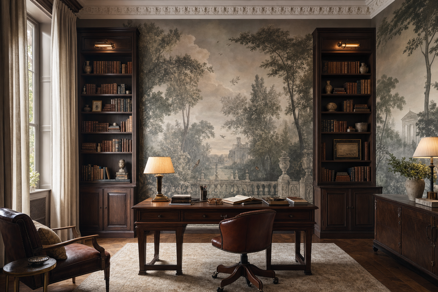
Luxury wall murals for home offices can correct that. A panoramic landscape, a grisaille garden, an architectural capriccio or a quiet botanical scene can give the study a horizon without making it perform like a reception room. It can turn a wall of cabinetry into a room of memory. It can make a screen feel less tyrannical by giving the eye somewhere civilised to recover.
Why a Mural Belongs in a Room for Thought
Work rooms benefit from depth. Not visual clutter, not decorative noise, but depth. A mural can create the sensation that the room continues beyond its joinery: through trees, across water, into a pale courtyard, toward a ruin softened by distance. This matters physically as much as aesthetically. When one spends hours at a desk, the eye needs an alternative to the flat glare of a screen.
The current wallpaper conversation supports this shift toward atmosphere rather than mere pattern. ELLE Decor’s 2026 report on wallpaper trends describes a move toward wallcoverings with emotional presence, tactile surfaces, hand-painted character and sophisticated colour. A study is perhaps the most exacting place to apply that idea. The wall must have enough life to hold attention, but enough discipline to protect it.
For that reason, I would begin by asking what kind of thinking the room must support. A lawyer’s library may need solemnity and order. A writer’s study may tolerate more weather and melancholy. A collector’s office may ask for something that can converse with books, maps and objects. A creative director’s work room may require a sharper scenic gesture, provided it does not become visually exhausting by noon.
Choose Depth Before Drama
The safest mistake is to choose drama. It looks persuasive in a presentation and often disappoints in use. A home office is not an entrance hall, where the mural may announce itself in one bright theatrical moment. Nor is it a powder room, where intensity can be sustained because the visit is brief. The study is a room of return. Its beauty must survive repetition.
Landscape is usually the most generous choice because it offers distance. A low horizon, a grove, a garden wall or an invented view beyond a balustrade can make even a compact office feel less compressed. Grisaille is particularly useful here. It supplies narrative and pictorial intelligence without asking colour to do all the work. Sepia, smoke, moss, chalk and mineral blue can be far more restful than a highly saturated scenic.
Architectural papers have their own authority. The V&A’s wallpaper collection traces the medium across centuries, including Chinese hand-painted papers and architectural wallpapers. That history is important in a library because the room already contains evidence of time: bindings, papers, frames, inherited desks, marginalia, perhaps even the useful dust of a serious shelf. A mural in such a room should not pretend to be a novelty. It should feel as though it has earned its place among other durable things.
Bookcases, Doors and the Art of Interruption
The library mural has one enemy: interruption handled badly. Shelves, sockets, cabinet doors, picture lights, ladder rails, air grilles, panels and screens all cut into the visual field. None of these is a problem if they are acknowledged early. All of them become problems when the mural is treated as an image to be admired before the room is measured.
Draw the joinery first. Then place the mural. I mean this literally. Put the shelf uprights, door heads, cabinet reveals, desk height, monitor position and lamps on the elevation before approving the composition. A bird should not be trapped behind a shelf stile. A temple should not vanish into a printer cupboard. A tree trunk should not appear to support a floating picture light unless that is the intended illusion.
Recent design interest in wallpapered doors is useful here. Good Housekeeping’s 2026 discussion of the wallpaper door trend focuses on continuity, sightlines and the way a flush door can disappear into the decorative field. In a study, that principle is not a novelty. It is often essential. A jib door to a filing room, a hidden drinks cupboard or a discreet archive cabinet should be composed as part of the mural, not left as an apology in the middle of it.
This is where the study connects naturally with our earlier piece on luxury wall murals for dining rooms. Both rooms rely on continuity around practical interruptions. The difference is tempo. The dining room is designed for conversation and candlelight; the study is designed for sustained looking. Its tolerances are quieter, but no less strict.
Light, Paper and the Seated Eye
The seated eye line is the true test of a study mural. Stand in the doorway, certainly, but then sit at the desk. Sit in the reading chair. Sit where the client will sit during a call. The mural must work from those positions, because those are the views the room will repeat every day.
Light should be assessed with similar severity. A hand-painted silk may glow beautifully in a morning room and become too lustrous behind a desk lamp at night. A matte non-woven scenic paper may be calmer and more legible under a picture light. A textured wallcovering can add softness and acoustic comfort, but it may also collect shadow in ways that obscure fine detail. There is no substitute for sampling under the actual lamp, beside the actual timber, leather, rug and paint.
I am particularly cautious with white grounds in studies. They can feel crisp at the presentation table and glaring in use. Deep grounds have the opposite risk: magnificent in an evening photograph, too heavy in winter daylight. The best library murals often occupy the middle register, with enough tonal variation to catch light and enough restraint not to compete with books. Think smoke, tea, vellum, lichen, weathered stone, faded ink.
Which Mural Language Belongs to Work?
Different wallcovering houses offer different kinds of intelligence. Nobilis can be persuasive when the brief asks for cultivated Parisian restraint, layered texture and colour that behaves well with upholstery and joinery. Zuber brings historical gravity, especially when a room can accept the authority of scenic paper as decorative architecture. De Gournay offers hand-painted narrative and luminous grounds, though in a work room I would temper the most exuberant birds and blossom with disciplined furniture.
Ananbo is well suited to the study when the client wants distance rather than display: a misted landscape, an old-world coast, a sepia horizon, a panorama that reads as recollection. Pierre Frey may bring archival wit or a stronger textile conversation. Elitis can be excellent where texture and touch are the primary luxuries. Designers Guild, used carefully, may suit a creative office where colour is part of the work rather than an interruption to it.
The key is not the brand name. It is the degree of mental occupation the mural creates. Some rooms need a mural one can study. Others need a mural one can forget until the lamp is switched on. A private office must leave enough air for thought.
A Specifier’s Checklist for the Thinking Room
Begin with function. Will the room be used for laptop work, reading, confidential video calls, collections, music, evening writing or all of the above? Then place the desk and screen before placing the mural’s focal point. A beautiful scene positioned directly behind a monitor may be no scene at all.
Plan the lower wall. Desk chairs move, leather ages, briefcases brush corners and books are taken down with less ceremony than we imagine. If the mural descends behind seating, specify the ground and finish with wear in mind. Where possible, protect vulnerable zones with joinery, a dado, a rail or a deliberate band of quieter pattern. Keep spare panels, record the dye lot or production reference and document the approved elevation for future repairs.
Do not neglect sound. Libraries are among the few rooms where softness is more than an aesthetic preference. Paper, textile, books, curtains and rugs all help make the room feel less sharp. A mural should join that acoustic atmosphere. If a wallcovering looks extraordinary but makes the room feel brittle, it has failed one of the study’s central obligations.
Finally, look at the room on camera. This is not vanity. The contemporary study is often also a video-call room, and a mural behind the chair can either lend authority or become an unfortunate distraction. Avoid faces, dense figures and high-contrast motifs behind the seated head. A garden, sky, architectural distance or softened foliage will usually be kinder.
The Luxury of Concentration
The finest study murals do not demand applause. They make concentration feel gracious. They give the mind a room in which to gather itself, and they give the objects of work – paper, books, lamp, chair, screen – a setting that is not merely efficient but humane.
This may be why the home office is such a compelling next subject for the luxury mural. We have already considered staircases as moving narratives and ceilings as the fifth wall. The study asks for something quieter: a wall that can remain with you through the work of a life.
Choose it slowly. Hold the sample beside the books. Turn on the lamp. Close the door. Sit in the chair long enough for the room to stop performing. If the mural still gives distance, still flatters the light, still leaves the mind clearer than it found it, then it belongs. That is the luxury of the thinking room: not spectacle, but sustained attention made beautiful.